BlastX Consulting
Design & Brand Alignment
When I joined the BlastX Consulting team in 2021, the company was just beginning its transition from a pure-play data analytics consultancy to a trusted digital experience consultancy. The marketing department was small but agile, and as the second designer on the team I took on a variety of responsibilities including digital design, print design, copywriting, and even a bit of motion design. Working across so many disciplines gave me a comprehensive view of the BlastX brand, and I ultimately took on the role of brand steward.
Results & Deliverables
- Brand Alignment
- Case Study Template & Design
- Print-Friendly eBooks
- Social Media Graphic Templates & Design
- Other Digital & Print Collateral
Social Media Templates & Design
One of the first brand touch points to get a complete review and refresh was the BlastX LinkedIn page. To drive a more consistent presence on the platform, I developed a variety of templates for everything from case study summaries to employee recognition posts.
Case Study Template & Design
Case studies were next on the list for a refresh. The case studies available when I started at BlastX were designed to fit an 8.5 x 11in. sheet of paper in portrait format, which was great for printing – but these were awkward to show in presentations and just didn't make sense for a digital-first company like ours.
I worked with BlastX consultants to develop a new, more compact case study template that could easily be added directly to presentation slides without sacrificing readability.
The team loved the new format – it was easier to present and eliminated the tedious work of copying and pasting content to make it fit a 16:9 slide. Several other materials received a similar treatment, saving leadership and consultants valuable time when putting together slide decks.
Additional Presentation Content
Several of our other key collateral pieces received the portrait-to-landscape treatment as well, again making this valuable content easy to integrate into any presentation. This format also turned out broadly to be more user-friendly—it fit comfortably on computer screens without requiring the reader to scroll for additional content.
While our minds were on the topic of improving our presentations, we couldn't resist the temptation to play around with a little bit of animation. We were pretty thrilled with how our first animated title screen turned out!
Print Collateral
When conference season came around each year, it was clear that even our digital-first team would need print collateral in order to better connect with and inform booth visitors. I worked with the rest of the marketing team to develop flyers and brochures that were just as visually dynamic as our digital content.
One of the biggest challenges with print is achieving the same vibrant colors that define the brand in a digital context. Our characteristic bright magenta color was a particular challenge, especially when overlaid on imagery at 80-90% transparency. We worked around this by adjusting the color and printing on the most vibrant white paper available.
Print-Friendly eBooks
In its prior form as Blast Analytics, the company had published a lot of technical content that spoke primarily to analytics practitioners. As BlastX, we needed to speak to a difference audience: the CMOs and customer experience leaders looking for answers in an increasingly competitive world.
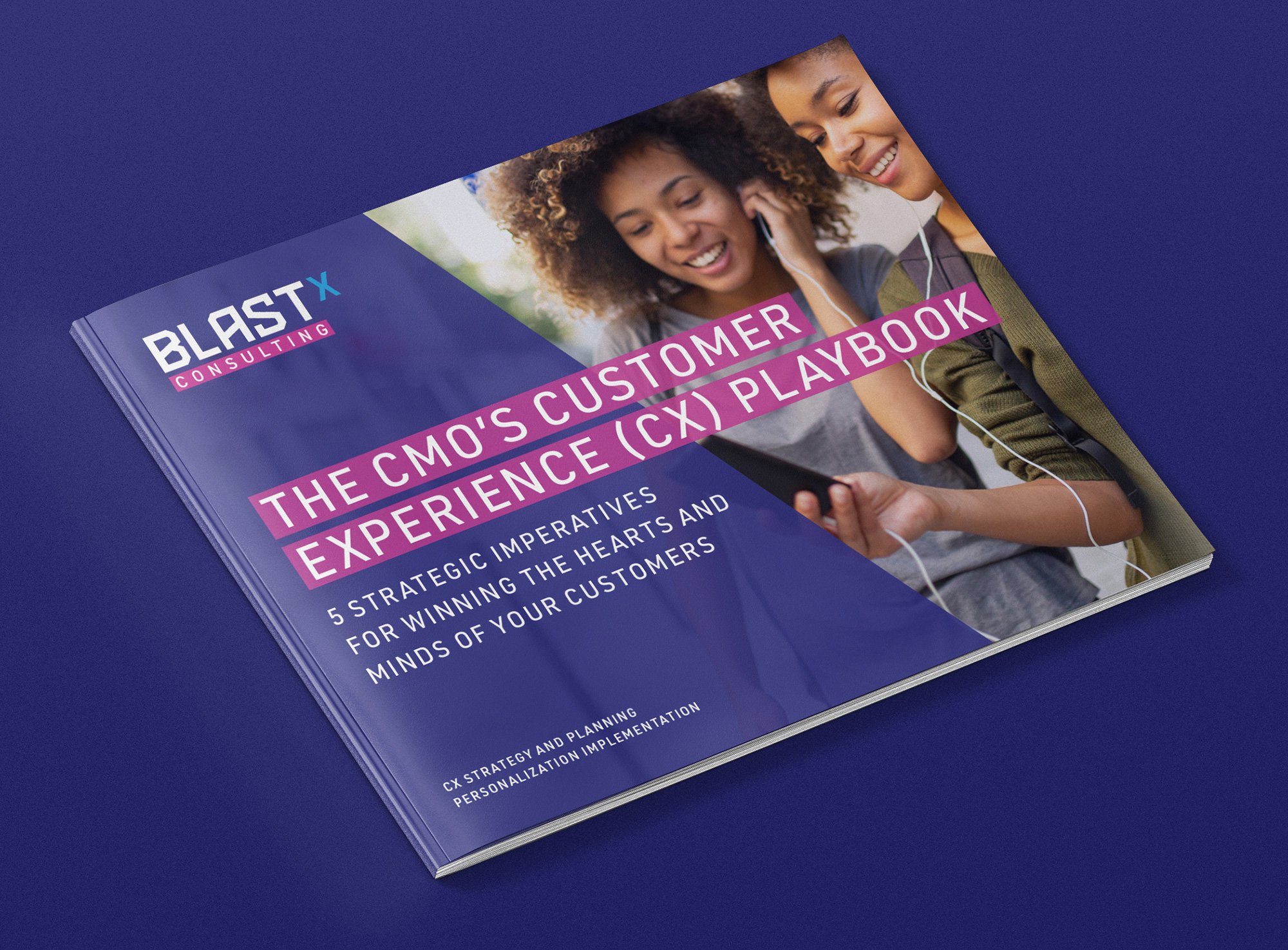
One action we took to accomplish this was shifting from white papers to eBooks. We collaborated with our consulting leadership team to develop a series of "Playbooks" that provided guidance and captured the Customer Experience zeitgeist in a short, easy-to-digest format.
Although they currently exist only as digital editions, we designed these eBooks with the possibility of print editions in mind – in case the need ever arose, we wanted to save ourselves the trouble of re-engineering the files later.


