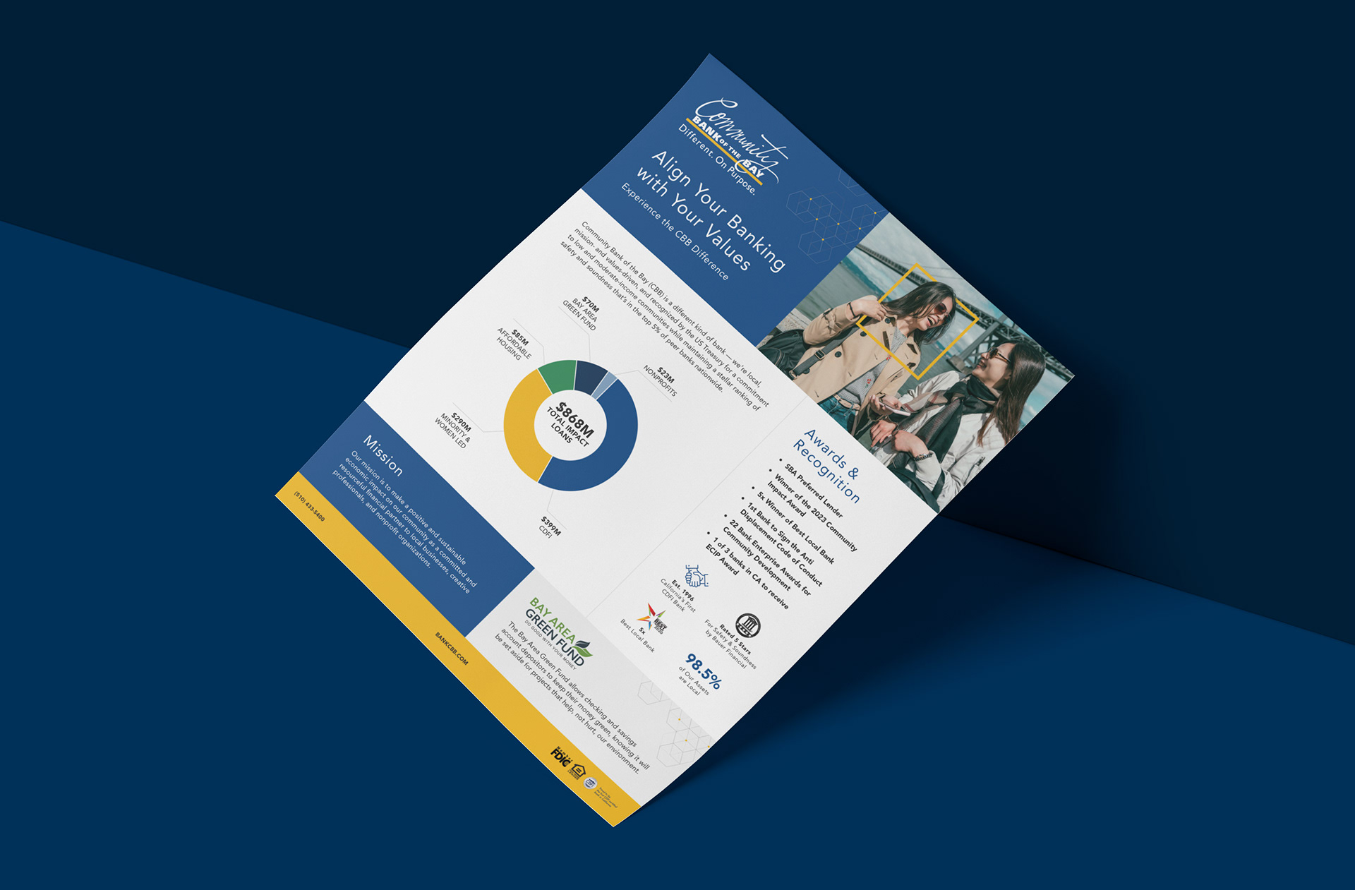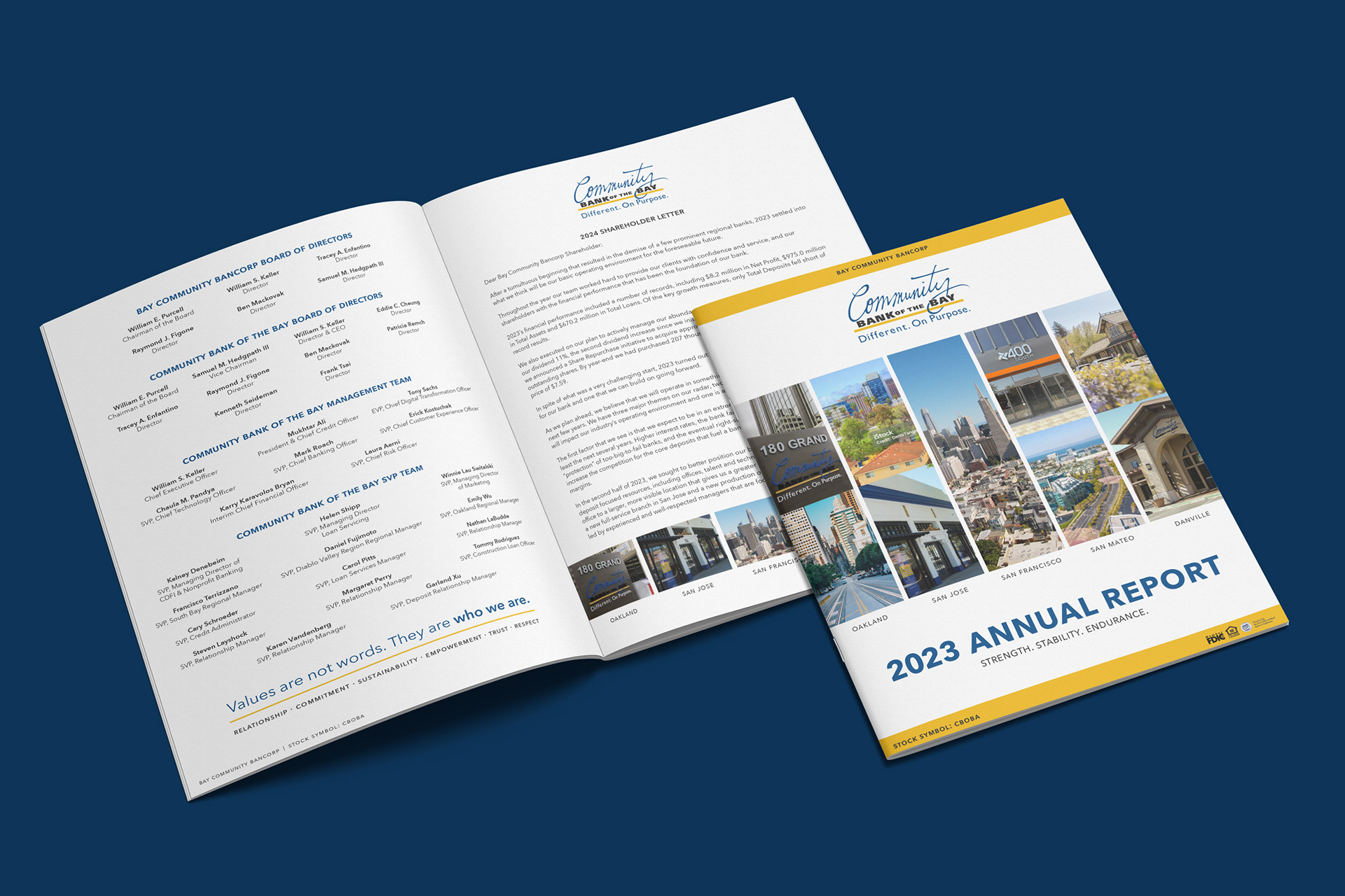
When I began working with Community Bank of the Bay in 2021, a lack of clear brand guidelines and the occasional case of "design by committee" were holding them back. Their print collateral was a mixed bag – some clean, some cluttered, but all lacking the clear voice and sense of purpose that they had when they talked about themselves.
I worked with their team to develop a more cohesive and professional set of printed materials that reflected what made them such a beloved Bay Area institution: their optimism, their people-first approach, and their drive to continually demonstrate what a great community bank can do for the people it serves.
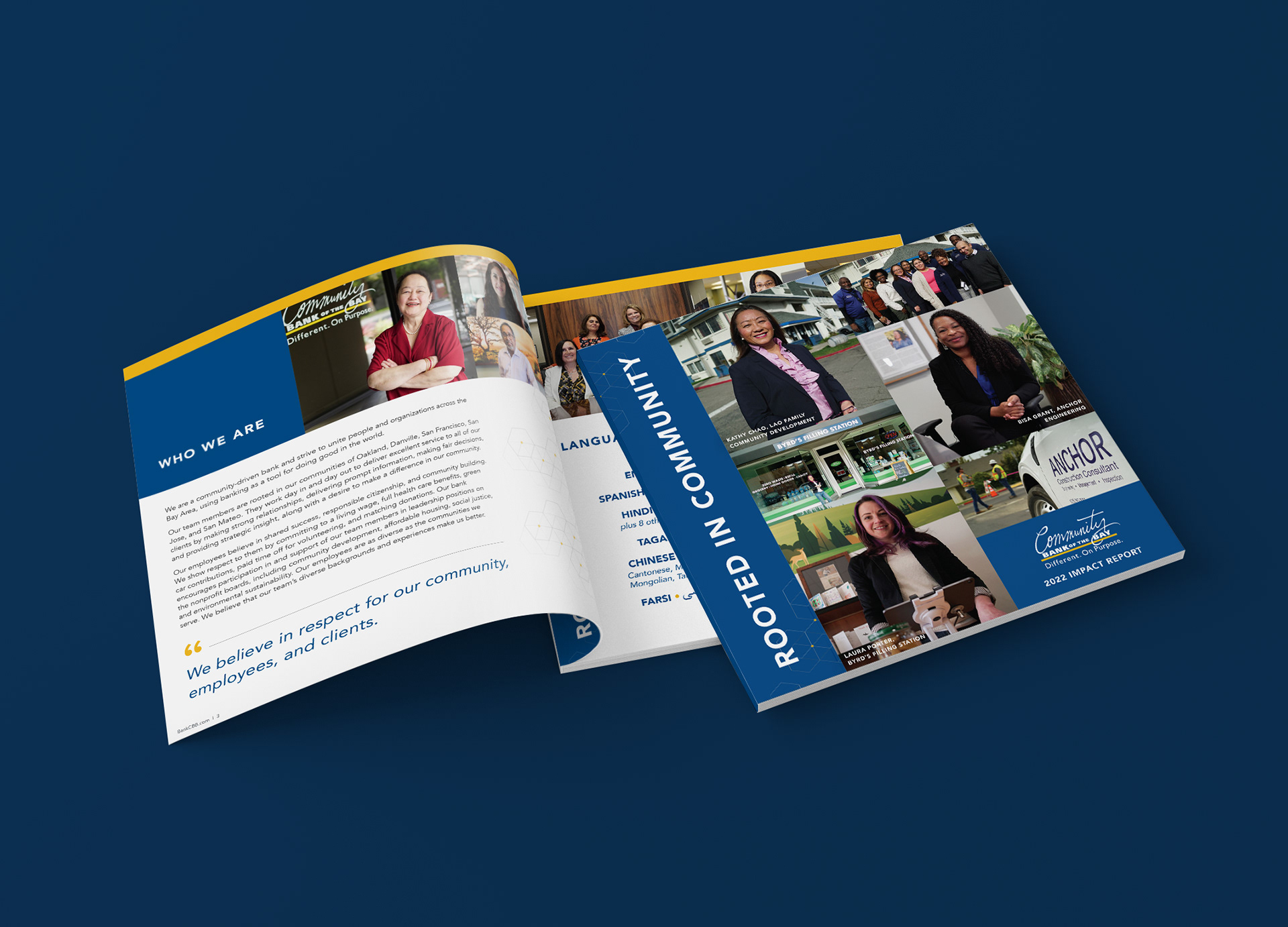


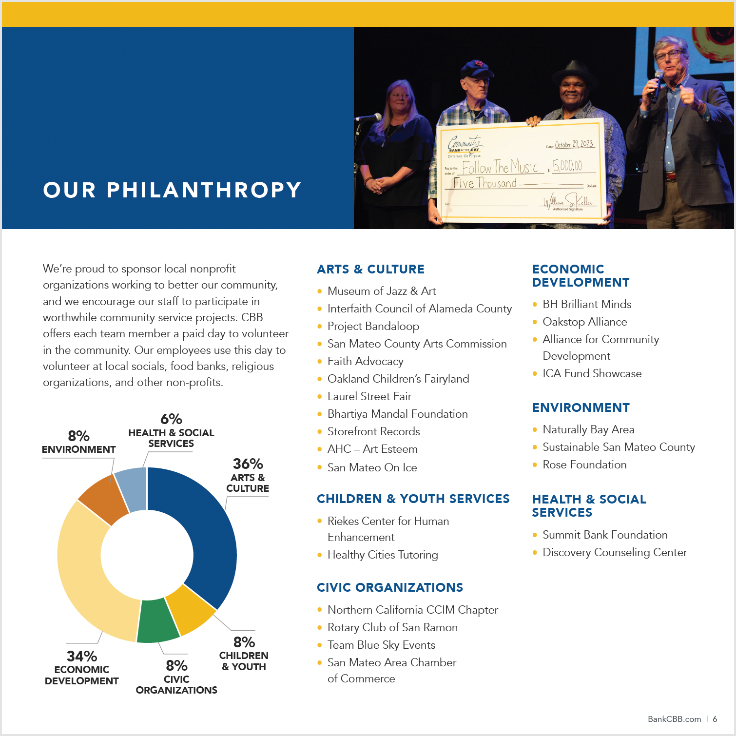


In the process of developing Community Bank of the Bay's new library of print collateral, I helped them refresh some of their core brand components including their brand colors, typography, photography treatments, and iconography. Together, we created a library of components they could pull from to bring flavor to everything from slide decks to rack cards.

The brand refresh included a mini brand package for their Bay Area Green Fund, which needed to complement their primary brand while also driving home the environmental focus of the fund. To keep things simple, we stuck to a simple color palette for this sub-brand – one that felt slightly fresher and, of course, a bit "greener".

To date, Community Bank of the Bay's refreshed collateral library includes redesigned annual reports, impact reports, flyers, rack cards, and presentation templates, as well as a number of social media graphics derived from the infographics and other visuals created during the print design process.